

When I started working as a designer at karlssonwilker inc. one of my first projects was to design and develop the studio's online platform, (website).
Since then, together with Jan and Hjalti I have designed and partially developed three websites for karlssonwilker. This year, once-again we entered the exciting venture of re-designing our online home.
During a 6 month period we designed and developed—together with our dear friends at v-a.pt—a website to showcase a selection of projects that identify and embody the spirit of our design studio and practice.
The challenges of creating something for ourselves is—as with most things in life—a hard task. And for a couple of months, we left the project almost on hold. However, after we launched Remai Modern, the Reykjavik Art Museum, Samsung x WeWork among others. We decided that we needed a website that could not only show the outcome, but also to tell the project story and open a window into our design process.
With this in mind and focusing on letting the work be the leading directive, we created a responsive project page grid, that allowed us to have a flexible way of tell the very different stories of each project. The grid, using Wordpress, was carefully crafted with multiple fields of content such as images, video, color, slideshows, captions, side-captions, etc. which allowed us to have control of the design while make every project look unique.
When we started designing our website we had just moved to our new building in Ridgewood, so most of our archive was still in boxes. First, we had to settle into the office space. And once we had our basement partially ready, we had to unbox and re-organized all the materials. Not to mentioned re-installing servers, computers, hard-drives, etc. All, while making sure design was getting done.
Another crucial part of this project, was on the photography side. Most of our projects at karlssonwilker start with a little task. For example, we started collaborating with the Museum of the Moving Image on a brochure and since then, we have re-designed their identity among other on-going collaborations.
So, in order to tell a comprehensive story of the projects we had to shoot most of the materials. Which, for the sake of time, forced us to make a selection of projects to showcase on the website. This was a big departure from our approach in the past two websites, where we displayed every single project we had worked on.
The selection was made based on three things, one most recent projects. Two, most successful. And three, projects in curated design categories.
In the course of time, the photography effort was streamlined and the overall look and feel made consistent.
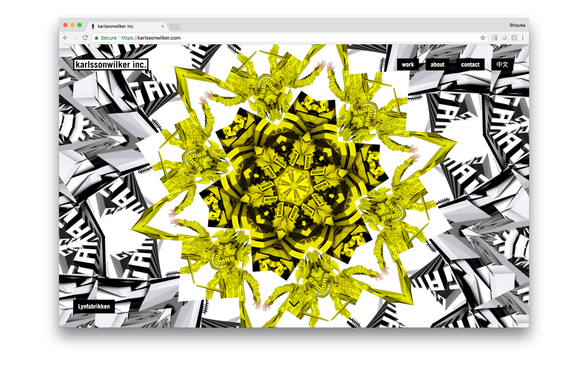
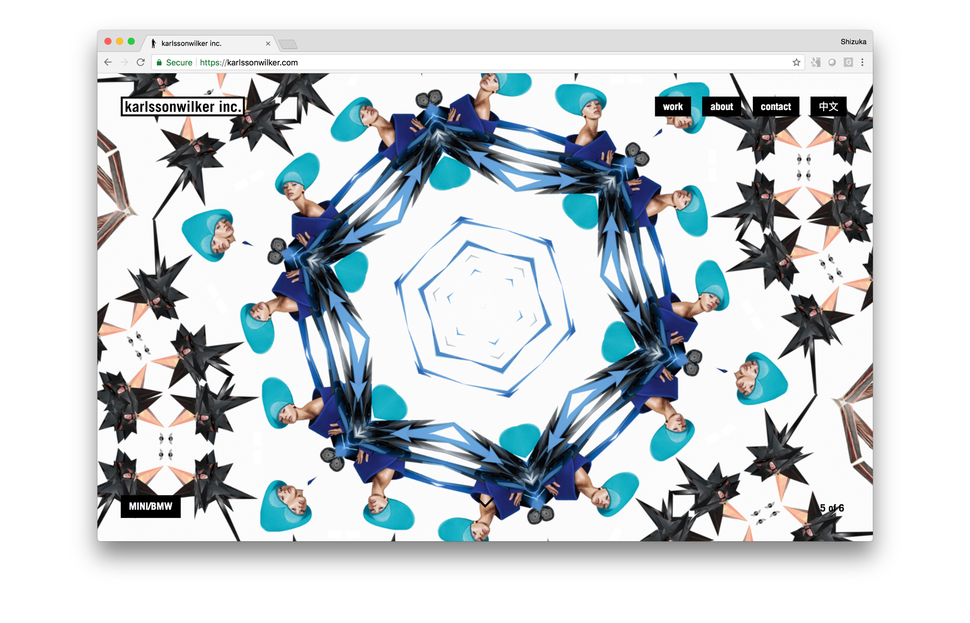
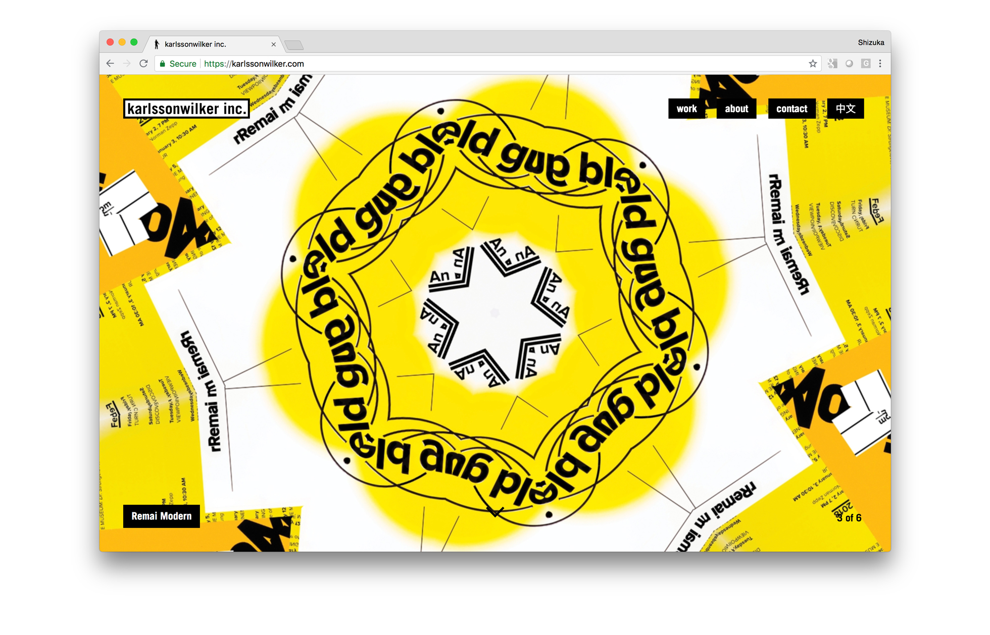
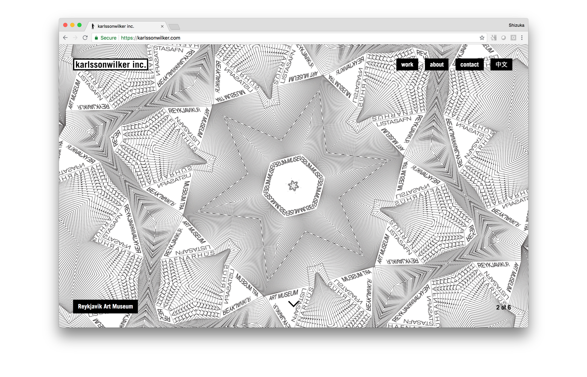
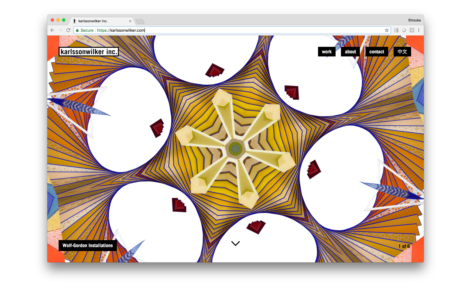
When designing the website, we came across a random jQuery plugin (https://www.script-tutorials.com/demos/43/index.html) that we used to start playing with the homepage kaleidoscope. The goal was to create an user experience that was purely visual right from the start. The landing page is a slideshow featuring selected projects. Utilizing various images of the project, the user can playfully view different elements of the project. For us, it was interesting to explore the concept of creating a new visual experience based on finished projects.
At the same time the front and backend were being developed, the narrative for each project was being delineated. Again, we faced another challenged, writing about our own design, about our own process is not an easy task. Hence, we went through multiple versions until we landed on the current informative voice. The about timeline, was originated on one of the copy-writing discussions. On the timeline, the user can explore our own storyline starting with our studio inception in 2000.
Finally, while developing the website we had to create different device and browser strategies. The mobile-friendly kaleidoscope was re-designed using the gyroscope feature. And for Safari we had to simplify it to a minimalistic slideshow.
We launched our new website in July, 2018. And since then, we have noticed a big increase in visitors and press coverage.
Nonetheless, a website is not a static material and, we are currently working on launching our online store and few new surprises. We will continue to update our new home as we design new things with our clients and partners.
Meanwhile, please visit karlssonwilker.com.