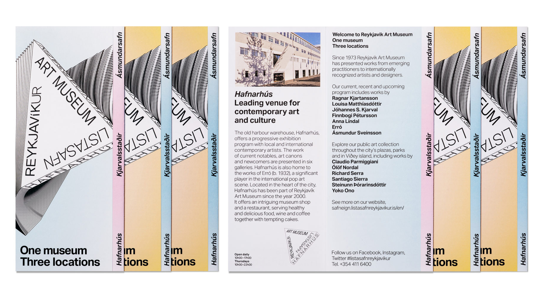
“One Museum, Three Locations.”

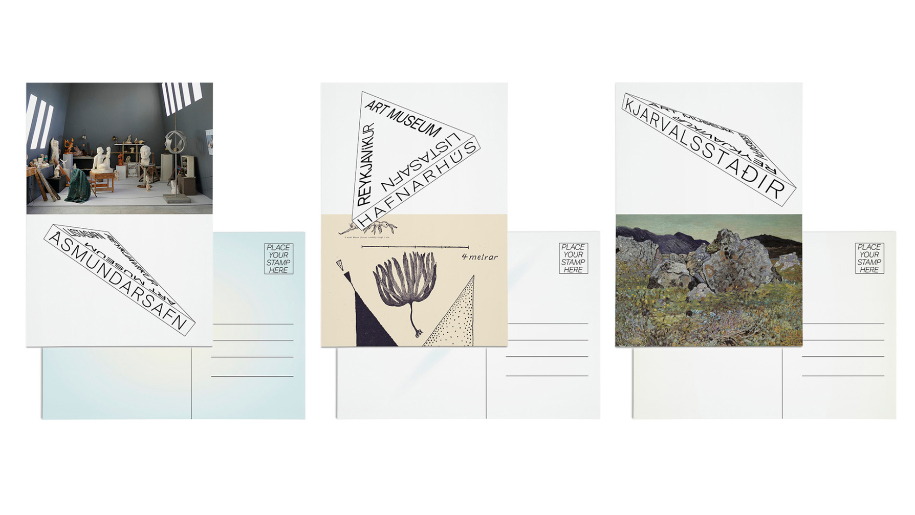
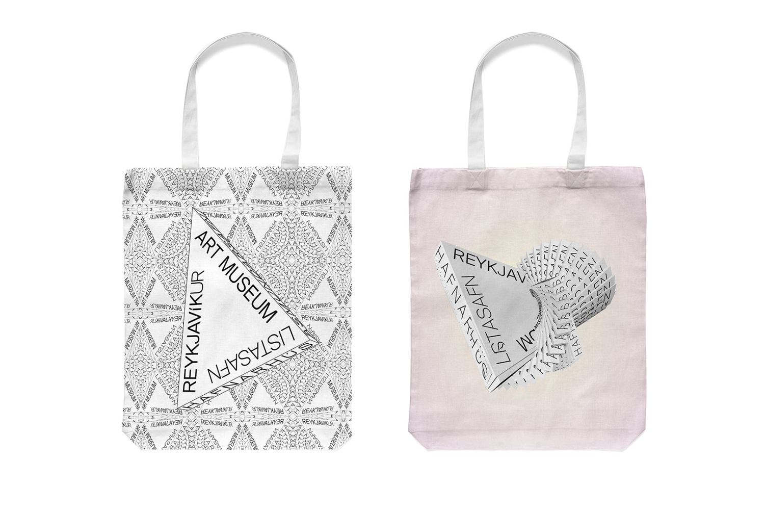
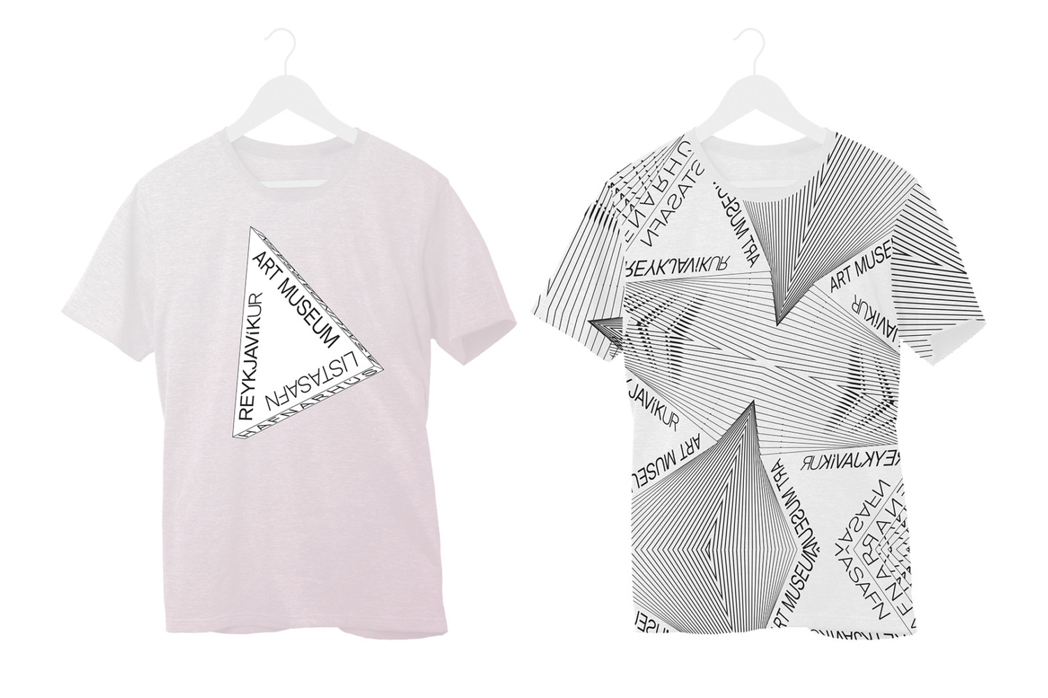
The triangular-shaped logo drew inspiration from the connection between the three houses, when connected on the map, the three museums form a very similar shape to the logo that we created.

We launched a creative exploratory phase which produced several project directions that were discussed extensively with the client. After additional sessions with the museum’s stakeholders,
the “triangle” was a clear choice.

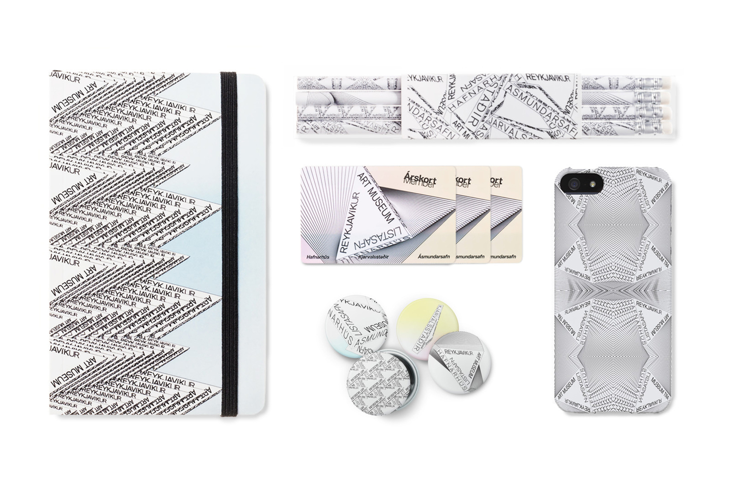
Stationery items using the fourth, museum-wide angle.
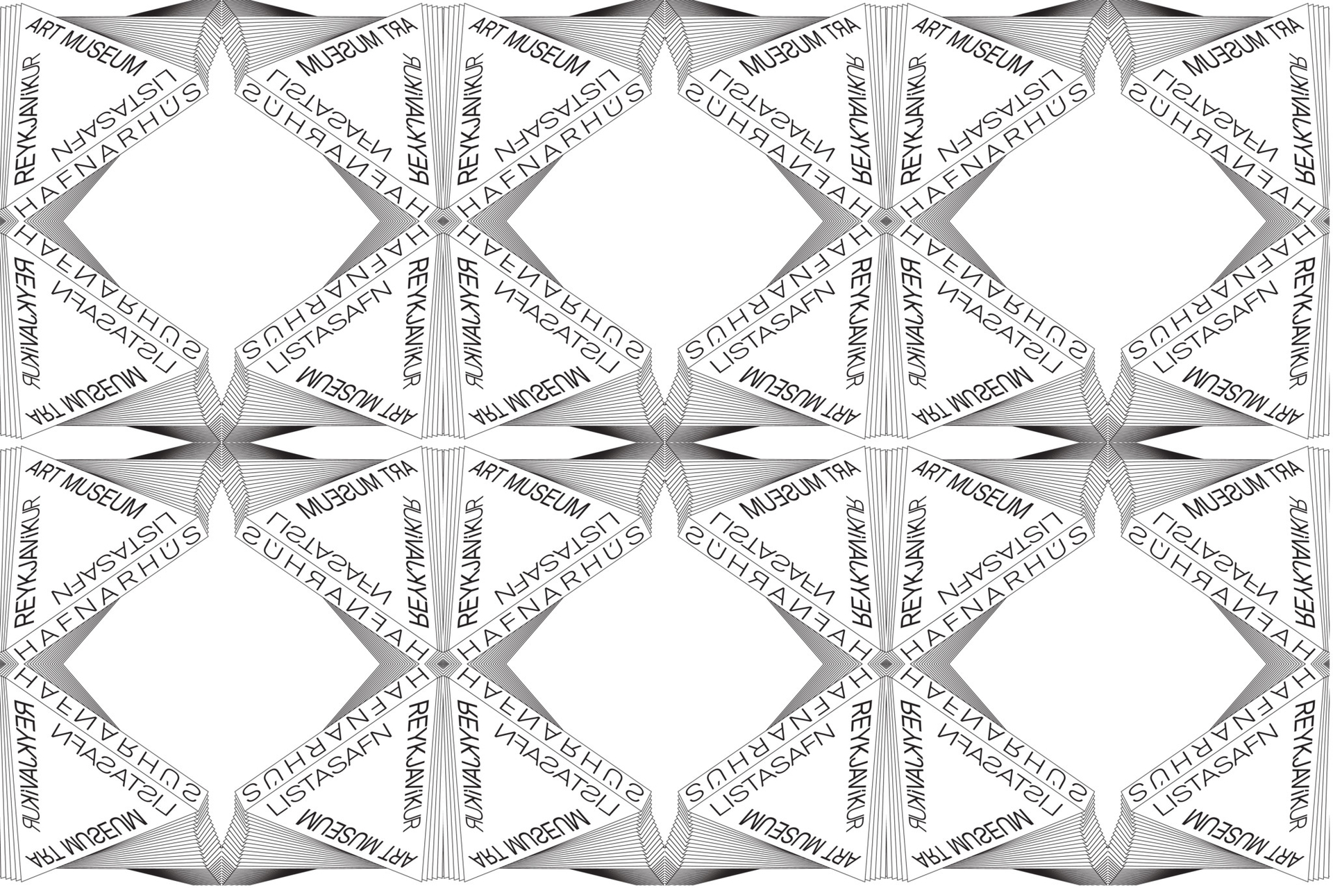

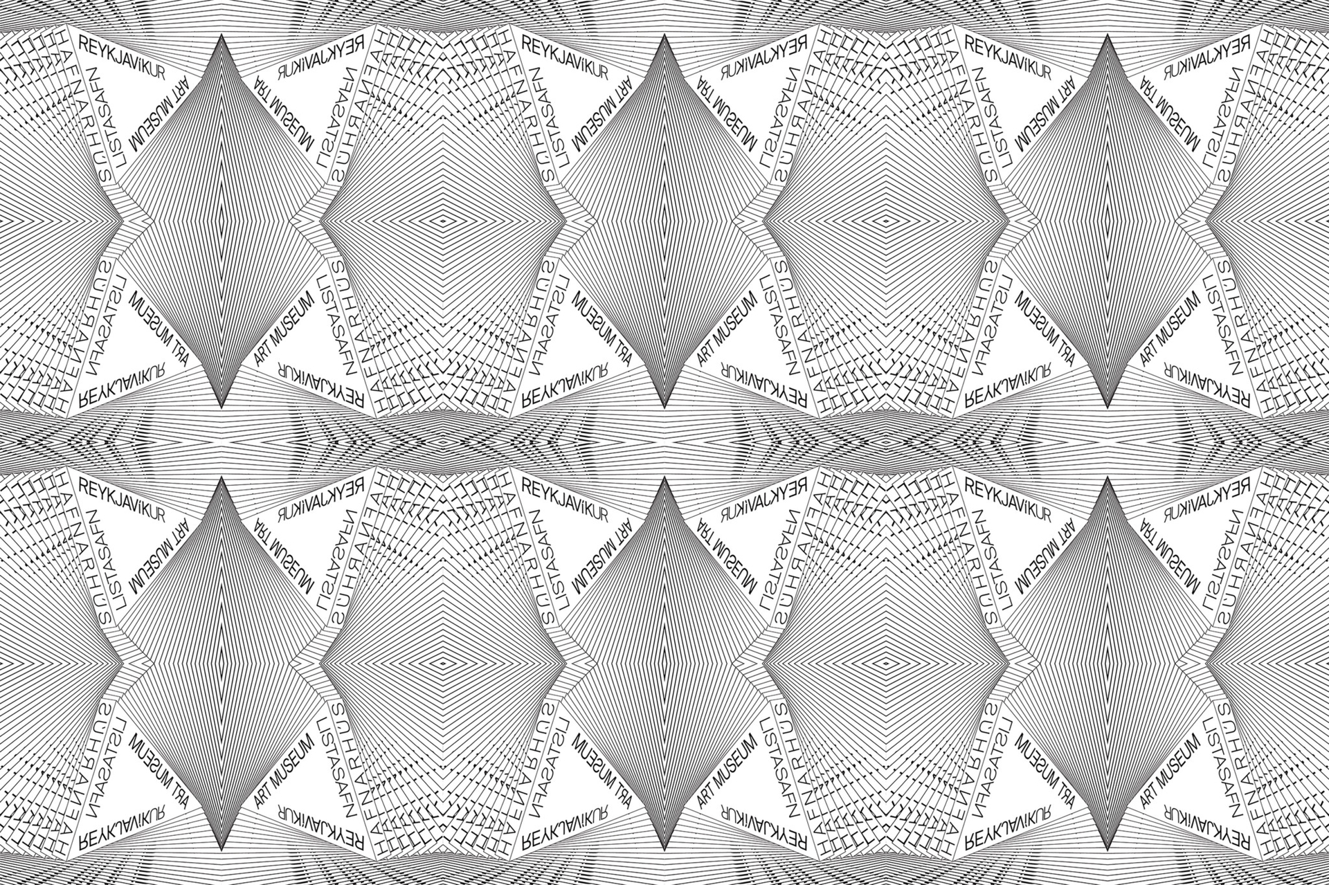
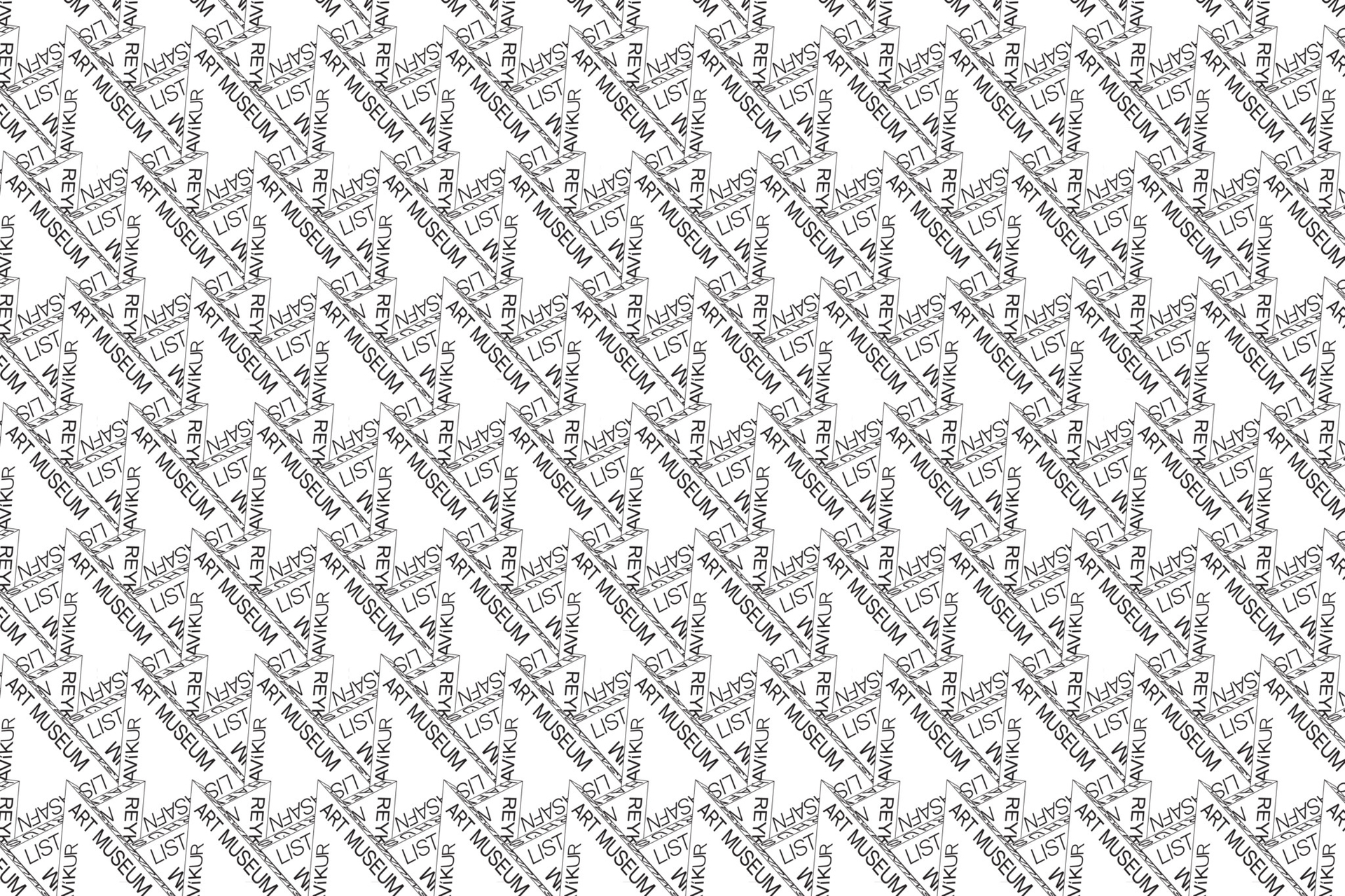
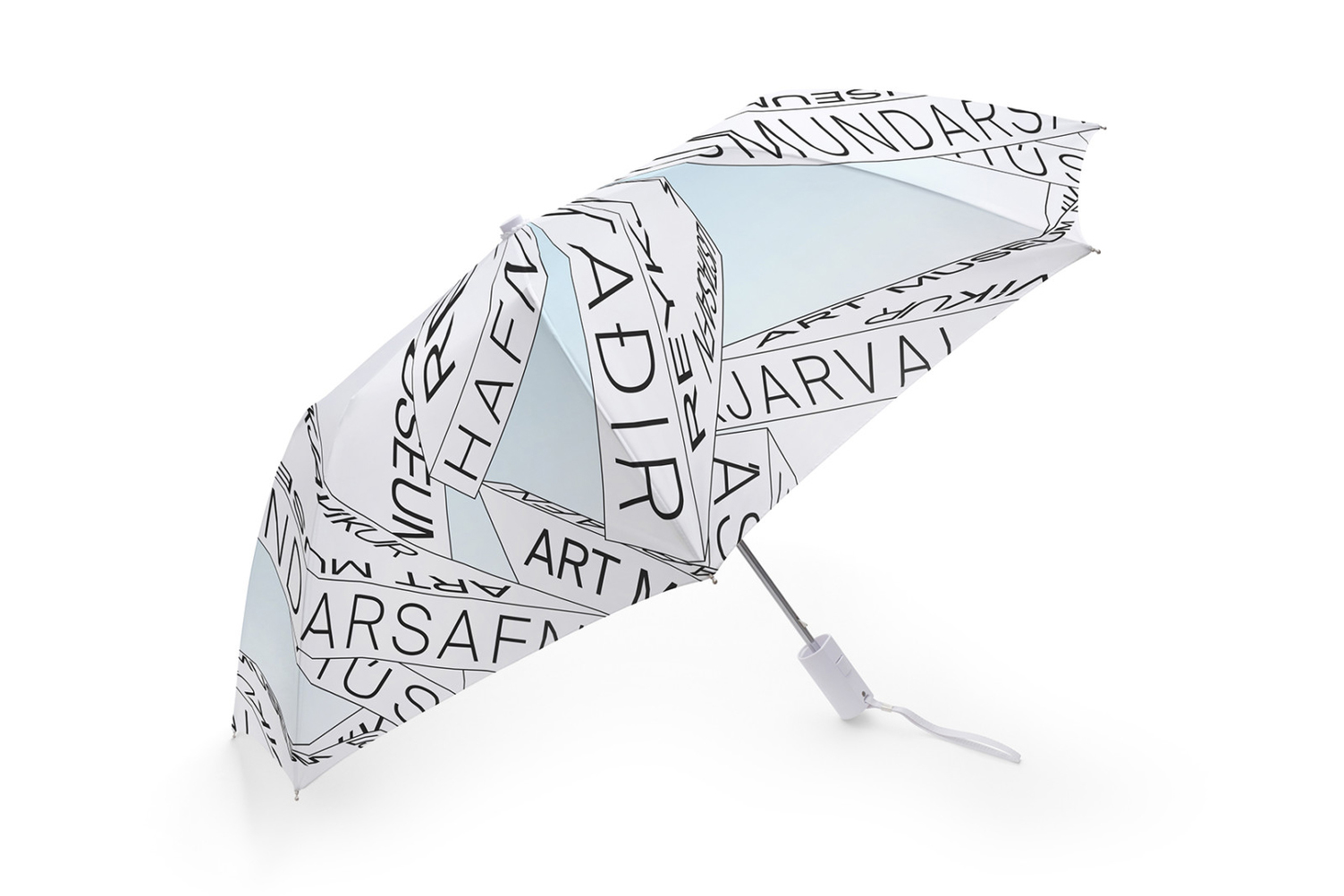
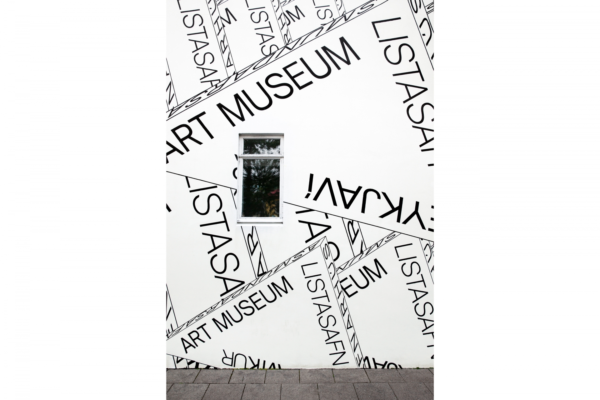
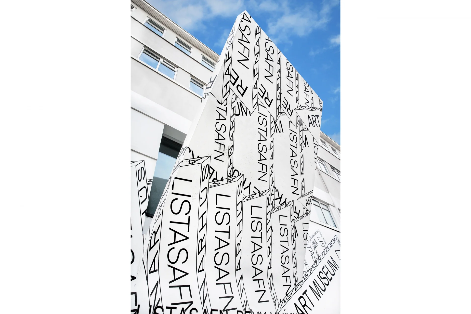
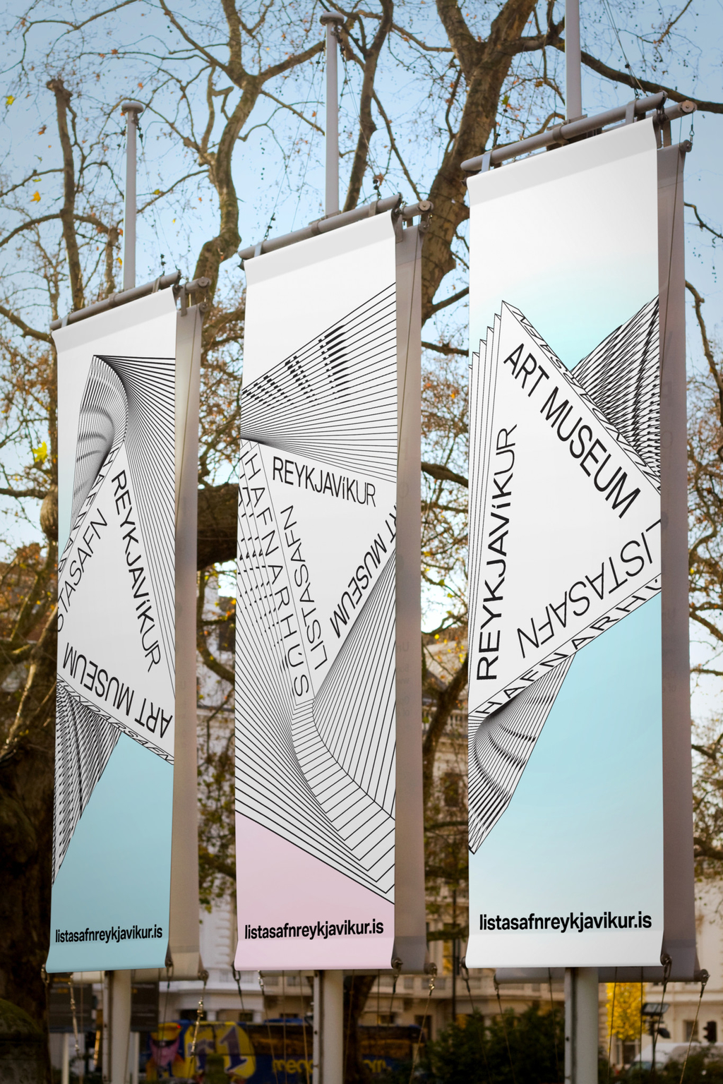
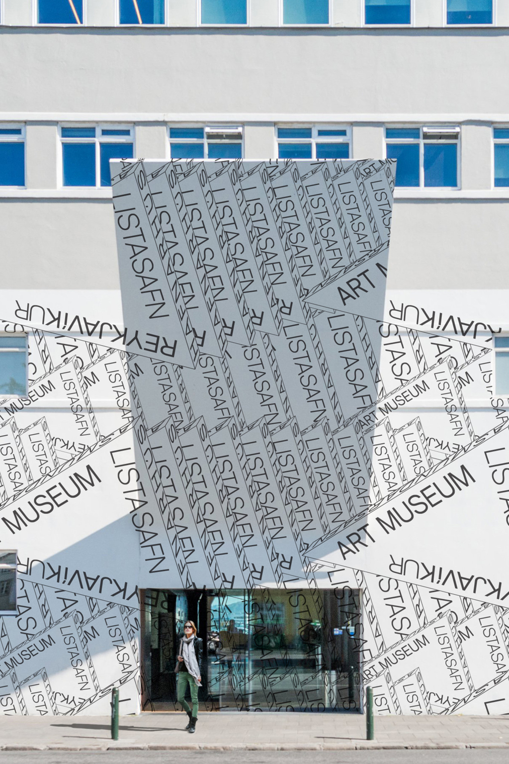
The final brand identity focuses on the extruded triangle, with the museum’s three locations placed on its sides. Based on that prism, we created patterns that were implemented across all marketing and communication materials, inclusive of signage, banners across Reykjavik, advertising, store items, etc. The identity uses both bi-dimensional and 3D logotype for programming and museum communications.


Museum Wayfinding


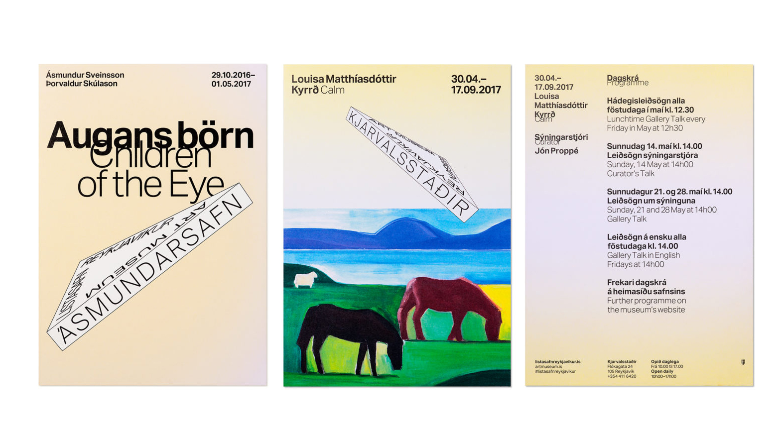
Exhibition Posters for the different locations.

Exhibition Poster in Reykjavik