


Initial Skecthes.
In early 2015, we received a ‘spam-looking’ email at karlssonwilker’s tellmewhy email account that invited us to answer to a Request for Proposal from the city os Saskatoon, Saskatchewan, Canada to design the identity of a brand new contemporary art museum. The Museum, Remai Modern, a 130,00sf building by then still under-construction, was set to open in October of 2017.
During this two-year period, and after successfully winning the project, we at karlssonwilker have been collaborating directly with the Museum director, Gregory Burke and his team in creating a visual identity that represents the newly founded institution.
––

The project started with Jan, Hjalti and myself preparing the RFP. An important part of running a design studio is to correctly respond to these proposals. The RFP required a substantial amount of research to understand the Museum’s needs, its cultural and historical background. Including their current vision, mission and finally, how their visual identity could lead to a successful representation of their programming and initiatives.
The fundamental challenges were clear to us from the beginning:
One, how to represent a Museum that was still defining itself;
Two, how to be mindful of the political and cultural tensions derived from a governmental funded institution and its physical location on a Treaty 6 Territory (First Nations land);
Three, how to attract both the local and international community to such a remote location;
To properly understand the scope of our mission, we traveled to Saskatoon for a series of interviews, visits and explorations with the different stakeholders. During our initial research, we met with the local community, which included artists, board and staff members, local gallerists, First Nation representatives, the Mayor of Saskatoon, the building contractors and many others. The discussions lead us to have a better overview of how relevant such institution was for the city of Saskatoon. While in the city, we were able to spend time with the Museum Director, Gregory and, get a grasp of his vision for the institution. A Museum for the Art of Now, that could challenge not only the local community but pose questions to the international art community itself.


With all these ideas in mind, the three of us traveled back to New York and, for the following weeks strategized, designed and debated extensively, while developing and exploring a broad range of directions, which culminated in a long presentation of ideas upon Gregory’s visit to our studio.
The discussion that followed, gradually led us to the “lower/UPPER” approach. A solution that seemed to be the ideal gesture for this Museum’s continuous quest to question itself and everything else, on their path to become a sort of anti-institution institution.
The logotype, rRemai mModern, is a custom extra heavy version Maison Neue by Milieu Grostesk. Proxima Nova designed by Mark Siminson is used for print and online communication. Both typefaces were selected due to their simplicity and unassuming characteristics.
Additionally, reaffirming the relationship between Remai Modern and the First Nations community and, after consulting Cree scholars. Together with the Museum Director, we have included Cree syllabics in some logo applications as a lock-up—the syllabics themselves a phonetic re-translation of “Saskatchewan”.
The final institutional visual identity focuses on the logo, a color scheme of anthracite and warm yellow, and idiosyncratic logo patterns.

Every seventh stationery set comes in yellow.

Identity Collateral.


During one of our research visits to Saskatoon we have encountered a hand-written and-drawn newspaper from 1884, “The Saskatoon Sentinel” in the City’s library archives. Struck by the naïveté and passionate commitment of the creator of the eccentric newspaper—which was handed house to house through the city, back when the population was just under 100—as well as the evident sense of play. We incorporated several of its design motifs, including the newspaper’s rampant double and triple underlined, angled, and opposing headlines, to all the Remai Modern’s program-related visual communication.

Printed collaterals are based on "The Saskatoon Sentinel", a hand-written, one-off newspaper from 1884 that we found in the City's archive.
The original newspaper was handed out from household to household. Bringing its energetic amateur style to today, the layout became the starting point for Remai Modern's program-related visual communication.


Opening Exhibition Catalog.


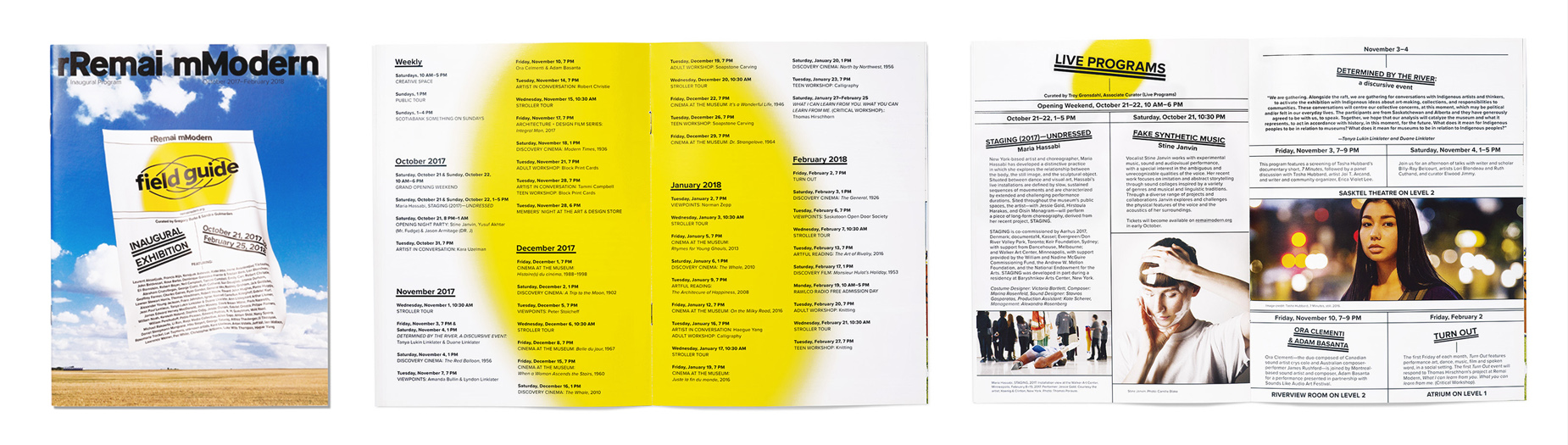
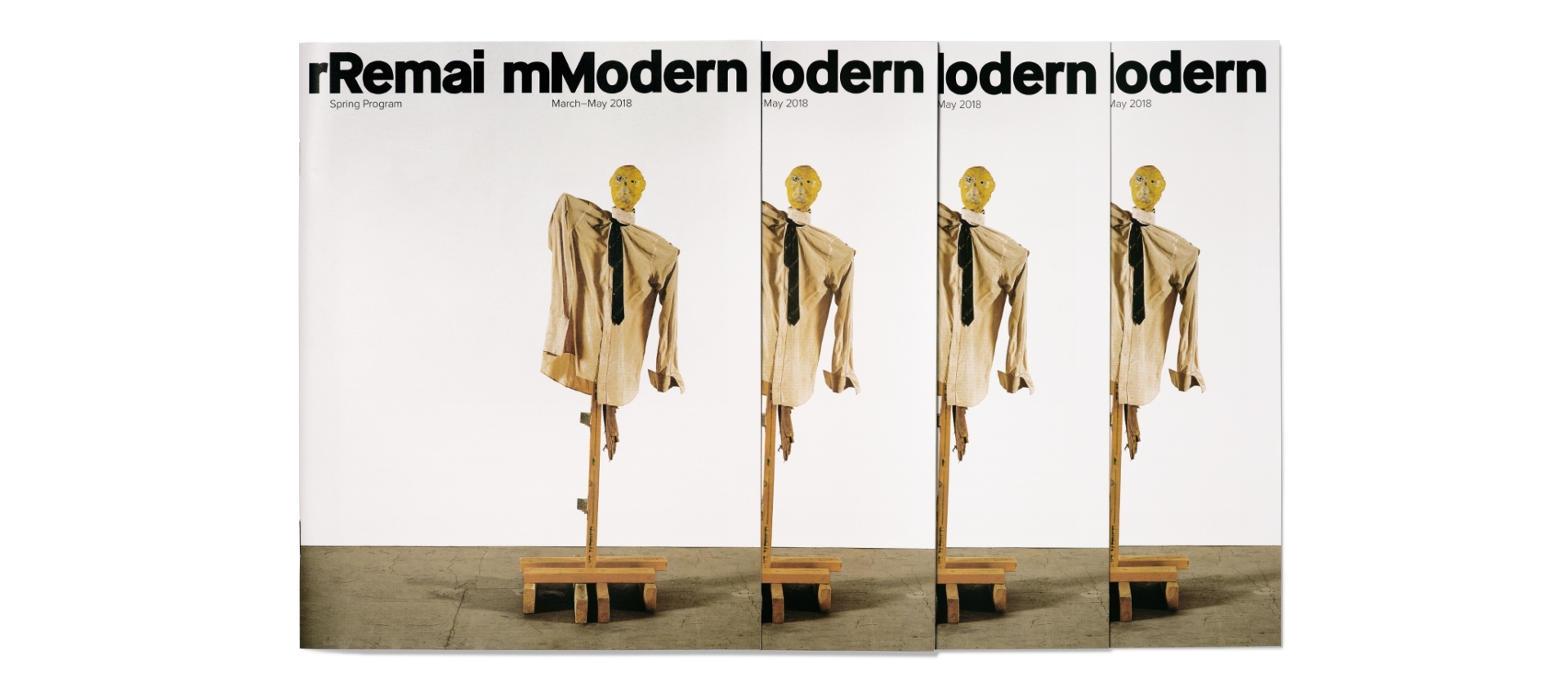
Spring Program Brochure.


Remai Modern Website: remaimodern.org
One of the key elements of Remai’s Modern visual identity and brand voice is their digital presence at remaimodern.org. Together with the Museum staff, we worked in creating an online platform that highlights Art as the central element online. We achieved that by, developing a web-commission gallery, where both curators, artists and designers work closely to bring an online art piece every month.
Furthermore, the Museum’s website evolved over the course of time. We designed a pre-opening website that after the Opening became the permanent digital platform for all the information related with the Institution, its initiatives, exhibitions, events and other.